The section of Adobe Camera Raw that includes Texture, Clarity, Dehaze, Vibrance and Saturation can make a big difference to the look of your images. They can also sometimes cause confusion, as some of the sliders appear to perform similar tasks. In this article, we’ll break each down for you so you can better understand their unique functions.
Clarity and Texture
Clarity and Texture are similar but not quite the same. Clarity has been around for a little while in ACR and it adds contrast to your midtones, leaving those tones at the ends of the spectrum untouched.
Clarity set to +100
Texture on the other hand is quite a new addition, added in 2019. Texture is a little like structure in other photo editing applications, it sharpens in one direction and smooths in another. Unlike traditional sharpening features though, it doesn’t target the edges of shapes but instead enhances textures already present and almost mimics a faux HDR effect. When Texture is used on an image with a shallow depth of field for example, it shouldn’t alter your background blur.
Texture set to +100
Likewise, in the opposite direction, when the Texture slider is used to smooth, you shouldn’t lose those important details.
Vibrance and Saturation
While Saturation affects colours across your whole image, Vibrance targets just your midtone colours. When you increase the Saturation slider, all the colours across your entire tonal range will be affected, from shadows right up to highlights. If you increase it a lot, it’ll make the colours really strong and gaudy, a little like a cartoon.
Saturation at +100
A good way to see the difference between the two is actually to decrease them. If we take Saturation to -100 you can see it removes all of the colour in the image, making it black and white.
Saturation at -100
However if Vibrance is decreased to -100 you’re left with an anaemic, muted image, but certainly one that still has some colour present.
Vibrance at -100
Dehaze
To demonstrate Dehaze I’ve switched to a photograph that was taken on quite a misty day with poor visibility.
Dehaze Before and After
You can see that by increasing the Dehaze slider it really brings back details that were getting lost towards the background. You can go too far with Dehaze, and it'll suffer the same tradeoff as other sliders, with 'too bright' colours and being too sharp. Dehaze is also handy if you want to make a misty picture look even more hazy, just drag the slider the opposite way to lose some definition from your background and gradually towards the front depending how far you pull the slider.
Less is More
As with all editing tools, less is often more and you’ll likely find the right balance between each of these sliders to get just the right result for your image. Here’s a before and after image with a more considered use of the options I’ve gone through in this article. There aren’t any other edits - not even basic corrections - so you can see what effect just these particular tools can have.
Balanced Sliders Before and After
And here's a larger version so you can see the image more clearly and the adjustments that have been made.
Balanced Sliders
If you're using an older version of Adobe Camera Raw, you might find this video helpful.
Adobe Camera RAW is a powerful program for processing your pictures. White balance changes colour of the white tones in your photograph so that they appear...
In the following steps, you will learn how to create a pastel gradient background in Adobe Illustrator and Adobe Photoshop. Cool and warm, this timeless trend will give a soothing effect to any design. All you have to do is look for the best gradient combinations.
Looking to download some pastel gradient backgrounds? Head on over to Envato Elements, where you can find a large selection of premium backgrounds, including this trendy pastel gradient background with AI and JPG files.
What You'll Learn in This Pastel Gradient Tutorial
How to create a pastel gradient background in Illustrator
How to create a pastel gradient background in Photoshop
What You'll Need
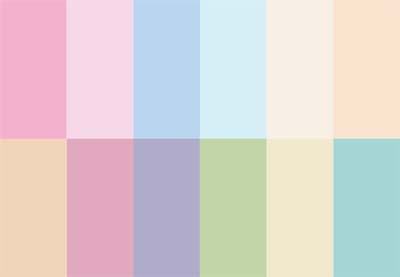
You will need the following image in order to create a pastel blue gradient background:
1. How to Create a Pastel Gradient Background in Illustrator
Step 1
Hit Control-N to create a new document. Select Pixels from the Units drop-down menu, enter 1920 in the width box and 1080 in the height box, and then click that More Settings button. Select RGB for the Color Mode, set the Raster Effects to Screen (72 ppi), and then click Create Document.
Step 2
Pick the Rectangle Tool (M) and create a shape the size of your artboard (1920 x 1080 px). You can do this manually or you can click on the artboard to open the Rectangle window. Enter the size values and then click OK.
Let's start with the most basic method that you can use to create a pastel aesthetic background. Make sure that your rectangle is selected, open the Gradient panel (Window > Gradient), and click the gradient thumbnail to apply the default black to white linear gradient.
Double-click the left gradient color and change it to R=131 G=132 B=240, and then double-click the right gradient color and change it to R=251 G=231 B=185. Simply click on the gradient bar to add a third gradient color, set the Location to 50%, and change the color to R=244 G=145 B=220.
You can set the angle of this pastel pink gradient from the Gradient panel, or you can select the Gradient Tool (G) from your toolbar and adjust the angle of the gradient directly on the shape.
Step 3
The second type of gradient that you can use to create a pastel aesthetic wallpaper is a radial gradient. You can easily apply one using the button from the Gradient panel.
Pick the Gradient Tool (G) to adjust the size of this gradient and use that black dot handle to squeeze or stretch the gradient as you wish.
Step 4
The third type of gradient that you can use to create a pastel aesthetic background is a freeform gradient. You can easily apply one using the button from the Gradient panel.
Illustrator will add four color stops to your rectangle. Select the color stops one by one and adjust the colors as shown below.
Step 5
You can always add a new color stop with a simple click, or you can delete a selected color stop.
Using the circular area around the color stop, you can increase or decrease the spread of that color. This value can also be adjusted from the Gradient panel. Select the bottom left color stop, and increase the Spread to 100%.
Simply click and drag a color stop to change its location.
Step 6
Another way of creating a pastel gradient wallpaper is by using a mesh.
Create a rectangle that covers your entire artboard and make sure that it stays selected. Pick the Mesh Tool (U) from your toolbar and click in the center of your selection to turn your shape into a mesh. Now you can easily select these mesh points and change their colors as you wish.
Switch to the Direct Selection Tool (A) to select the leftmost mesh points and change the color to R=107 G=245 B=202. Select the rightmost mesh points and set the color to R=253 G=225 B=186. Then select the middle mesh points and change the color to R=252 G=128 B=180.
Step 7
With your mesh and the Mesh Tool (U) still selected, add a new point as shown in the first image.
Switch to the Direct Selection Tool (A), select the mesh points highlighted in the second image, and change the color to R=235 G=240 B=168.
Step 8
If you want to adjust the position of a mesh point or a mesh point handle, simply click and drag it using the Direct Selection Tool (A).
Pick the Anchor Point Tool (Shift-C) when you want to drag a mesh point handle independently or when you want to click a mesh point and drag new handles.
Step 9
Let's add a subtle texture to this mesh. Select it and press Control-G to Group it.
Make sure that your group stays selected, open the Appearance panel (Window > Appearance), and add a new fill using the Add New Fill button.
Select it and set the color to black (R=0 G=0 B=0), and then lower its Opacity to 70% and change the Blending Mode to Overlay.
Step 10
With that black fill still selected, go to Effect > Sketch > Reticulation. Enter the settings shown in the following image and then click OK.
2. How to Create a Pastel Gradient in Photoshop
Step 1
Let's start with the most basic method that you can use to create a pastel gradient in Photoshop.
Create a 1920 x 1080 px document and select the Gradient Tool (G) from your toolbar, and then click the gradient thumbnail from the control panel to open the Gradient Editor.
Double-click the left gradient slider and change the color to R=131 G=132 B=240, and then double-click the right gradient slider and change the color to R=251 G=231 B=185. Click somewhere close to the bottom edge of the gradient bar to add a third gradient slider. Select this new color stop, set the Location to 50%, and change the color to R=244 G=145 B=220.
Once you're done, you can click the New button to save your pastel gradient in the Presets panel, which will make it a lot easier to use it later.
Click OK to close the Gradient Editor panel. Focus on your canvas, and drag a path from the bottom left corner to the top right corner to easily apply your pastel pink gradient.
Step 2
Alternatively, you can apply a pastel gradient on a layer using the Layer Style dialog box.
Move to the Layers panel (Window > Layers) and add a second layer using the Create New Layer button.
Double-click this new layer to open the Layer Style dialog box, and enable the Gradient Overlay. Click the gradient thumbnail and select your saved gradient from that list, and then feel free to adjust the angle or the other properties as you need.
Step 3
The second type of gradient that you can use to create a pastel gradient background is a radial gradient.
You can easily switch to a Radial gradient using the Style dropdown menu. Keep in mind that you can manually adjust the cente point of the gradient directly on the canvas. Simply click and drag to change this location.
Step 4
Besides linear and radial gradients, in Photoshop you can also apply Angle gradients, Reflected gradients, or Diamond gradients.
Step 5
The Gradient Overlay technique can also be used to apply a pastel gradient to a photo.
Download this Heavy clouds from above photo and drag it inside your document. Double-click this new layer in the Layers panel to open the Layer Style dialog box and activate the Gradient Overlay.
Apply your saved gradient and change the Blending Mode to Hard Light to make the gradient blend with the photo.
Step 6
You can always try different gradients or blend modes. Feel free to use this pastel rainbow gradient or look for the best gradient combinations that suit your need.
Congratulations! You're Done!
Here is how your cool gradient background should look. I hope you've enjoyed this tutorial and can apply these techniques in your future projects. Don't hesitate to share your final result in the comments section.
Feel free to adjust that final pastel rainbow gradient as you wish. You can find some great sources of inspiration on GraphicRiver, with interesting solutions to improve your pastel gradient wallpaper.
Popular Pastel Aesthetic Backgrounds From Envato Elements
Envato Elements is an excellent resource for pastel aesthetic wallpapers. Here's a short list of some of the most popular pastel aesthetic wallpapers that you can find.
Don't waste your time looking for the best gradient color. This collection comes with the best gradient combinations and can be easily used to give your presentation a touch of color.
This massive collection of bright and vibrant pastel aesthetic backgrounds can be used for presentation backgrounds, foregrounds, websites, book covers, and more.
Want to Learn More?
We have loads of tutorials on Envato Tuts+, from beginner to intermediate level. Take a look!