When you first start working with animations in PowerPoint, it's easy to overdo animating your slides. This makes your presentations slow and often not enjoyable for the viewing audience.
Despite that, animations in a PowerPoint presentation can be a great tool for many purposes as you'll discover in this tutorial.
Here we give you a number of PowerPoint animation tips and tricks, so you can learn how to control your transitions better and enhance your presentation message with powerful effects.
You'll also get helpful tips on how to match your presentation goals to the animations you work with and learn how subtle, simple approaches to PowerPoint animations are often more effective.
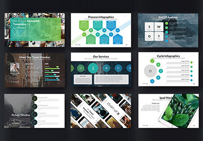
Now, before you can actually use animations, it helps to have a solid presentation ready to work from. To help you with that, there are a number of quality presentation templates made to save you time, such as this curated selection of easy to use designs:
Need Help? Download Our eBook on Making Great Presentations (Free)
We also have a useful compliment to this tutorial. Quickly grab it before you read on. Download our FREE eBook: The Complete Guide to Making Great Presentations, which will help you write, design, and deliver the perfect presentation.

Why Use PowerPoint Animations?
First, let's understand why we would use animations in a PowerPoint presentation. There are two common reasons:
- Animations help you control the pace of the delivery of your presentation.
- They can enhance the appearance and interest of your slides.
The above is typically achieved by transitioning either full slides, or a number of elements on a slide.
The best animations have an aesthetic use that matches your message, as well as help you control the pace of your presentation. Typically, animations just for enhancing the appearance of your slides tend to become frustrating for your audience.
Getting Started With PowerPoint Animations
Let's start with introducing the different types of animations in PowerPoint. In essence, the types of animations can be summarized by the following:
- Transitions
- Animations
Transitions are a type of animations in between slides. You can view the Transitions pane to view all possible transition effects you can use. These are ideal when you want to have a noticeable transition between two slides, as you'll find in some examples later in this tutorial.

Animations are animations on your slide. You can view your options in the Animations pane. These are often used as action effects while you're presenting your slide. For example, an animation can be used to highlight a particular element on your slide.

Your animations are controlled by using the animation pane. If you'd like to learn a little bit more about the animation pane in PowerPoint, I'd recommend to check out the following tutorials. During the tutorial, I'll also cover some basics of the animation pane as used in the below examples:
Discover how and when to add animation to PowerPoint. Without further ado, let's dive into these helpful PowerPoint animation tips and tricks.
10 Easy PowerPoint PPT Animation Tips, Effects, & Tricks for Beginners in 2021 (Video)
Do you want to add the best PowerPoint animations to your next presentation? Watch this quick screencast for some powerful PPT animation tips, effects and tricks.
Or study the complete written tutorial below for PPT animation tips and tricks:
1. Animation 101: Master Your Context
The key lesson in effective animations is to understand when to use an animation. An easy-to-remember guideline is the 80/20-rule. What 20% of your content in your presentation is the most important? That is the content that might be worthwhile for you to add animation to.
For example, announcing a new product line could be the most exciting element of your presentation. In this context, it makes sense to highlight this by adding a build in animation for example.
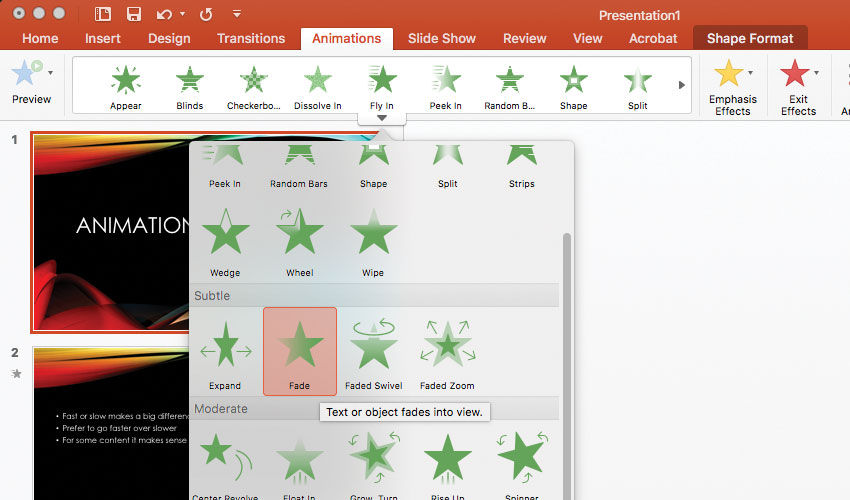
PowerPoint assists you by labeling their animations in different strength categories, such as subtle, moderate and exciting.

These different animation strengths can help you use the right animation in the right context. For example:
- The most important content in your slide would be ideal to use an exciting animation.
- Noticing that you're quarterly profits are a little higher this year would be ideal to use a subtle animation.
In summary: Define what is your most important content in the presentation. Next, when you choose an animation, make sure it's strength correlates to the excitement of the content that you are presenting.
2. Animation 101: Control Your Timing and Duration
Once you've mastered where to add animation, next up is to understand when to animate.
As described in the beginning of the tutorial, you can use transitions and animations. I'd recommend that you only choose one of either per slide that you'd like to add some animation to. Combining both often becomes a visual overload for your audience.
Here again, the context of the slide matters. If you'd like to surprise the audience with the whole slide, a transition could be ideal. If you'd only like to have a few elements appear dynamically, using animations will make more sense.
The duration of your animation matters as well and has a big impact on how your animation is experienced.
Have you watched a presentation with slow transitions between each slide? At first, an impressive visual effect (albeit slow) might be interesting, but afterwards it becomes a source of frustration as you see it over and over again. It's tedious.
The general rule is to have fast animations, unless you're animating something in which a slow animation makes more sense (such as presenting something brand new for example). I typically choose a timing of 0.5 seconds.

Animation Quality Control Tip
The best way to quality control your animations is to go through the presentation after you're done and only pay attention to your animations.
Ask yourself: How does the pacing feel? Are there sections in your presentation where there is too much animation? Too little? How's the timing feel?
Reviewing your presentation as a whole makes it much easier to estimate whether your choice of animation makes sense or not.
3. Animation 101: The Basics Work
Even when working to make your animations subtle and effective, it can still be easy to overdo it. The reasoning for this is that PowerPoint offers many different types of animations, which is a bit overwhelming.
There's a simple rule that helps make your presentation feel less heavy:
- Rule to Follow - Use the same animations throughout your presentation.
There's no point in adding many different transitional animations for the sake of variety. In fact, the variety will often distract from what you're actually trying to communicate.
Below are the types of animations which I personally use the most.
- Appear - To simply make an object appear in your presentation.
- Fade - Probably my most used animation that feels a little slicker than appear.
- Zoom - A good way to quickly add emphasis on an element in your slide.

Now that you understand the basic concepts of animation, let's dive into a few real-world examples and how animations can enhance your presentation.
4. Enhance Your Message With Simple Animations
One of the most common ways to use animations is to enhance a message. Let's look at how to add a simple animation to PowerPoint to enhance a message.
In a line-up of data, it might be there's interesting information but the audience is oblivious to it. Using an emphasis effect could help solve this. Take the below slide as example:

Notice how the result in Q3 was much higher. Imagine that a year ago, that quarter was actually the worst quarter. This is something you could mention verbally while giving the presentation, hence you want to highlight the result of Q3 as it went from the worst quarter to the best quarter in just a year of time.
This is an example of an interesting bit of information which can be emphasized by using an animation effect, instead of just putting the information on the slide itself. Here's the plan:
Step 1
In PowerPoint, you can accomplish this by selecting "Q3: 6% increase" and adding the following emphasis effect: Underline. Underline is a simple yet subtle way to add emphasis to text.
Step 2
Open the Animation Pane. Select the animation you've just added. In the Timing options, make sure that it starts On Click. This way, you can run over the facts and figures while presenting your slide and then have the animation be displayed on the moment you want it. For example:
- First run over the results of 2015, quarter by quarter.
- Then click and initiate the underlining of Q3.
- Finally, you tell the story how Q3 used to be a losing quarter instead of your strongest quarter to date.
Now you understand how pacing animations can be a much better way to deliver information than just presenting all the information on your slide directly.

5. Use Transitions Between Your Sections
A PowerPoint presentation, much like a story, typically has a beginning, middle and ending. To mark those points during your presentation, you could use an animation in the form of a Transition.
For example, you'd like to jump to your conclusion slide. In order to grab everyone's attention again, we'll be using a transition animation which packs a little bit more punch.
When you open the Transition Pane in PowerPoint, you'll notice that there are many different options and variations to choose from:

What will help you to make a decision of which transition to use is to think about the content of the slide that you're transitioning to. For example, if you're presenting a solution to a number of problems you've presented, the Fracture animation could be a strong metaphor.

A final tip for using a transition animation is to look into the Dynamic Content category. These are animations which will use your current designed slides as a basis and animate between that. For example, the animation will do something with the elements on the slide, or the background color of your slide. This is ideal if you'd like to do something more subtle.
6. Build Step-by-Step Animations into Your Slides
If you'd like to make an explanatory slide, that often means that there are multiple elements of information that you'd like to present. The easiest way to do this is to reveal a numbered (or bullet) list:

Instead of displaying all five steps at the same time, we'll display each step one by one. Imagine you're giving a cooking class. Showing one step at a time will help your audience to keep their focus on the next action and not run ahead.
Step 1
Open the Animation Pane. Select the first step and let's pick Fade as our entrance effect. Next, select the second step and also pick Fade again. Repeat this process for the remaining steps.
Tip: By careful to select each step individually, instead of all the steps at once. Otherwise, they will appear all at the same time.

Step 2
Now open the Animation Pane. You can see the five animations you've just added. When you click on the animation, you can open the Timing tab once again.
Now, in the context of cooking, instead of having it start on click, you might want to start the animation After Previous and choose a Delay.
You're basically building a timer in this sense. For example, imagine that in the class, everybody has five minutes to grate the zucchini. Select the third animation (sauté zucchini). Choose the After Previous timing and pick a delay of 300 seconds.

This is what will happen:
- Grate Zucchini will appear.
- 5 minutes (300 seconds) will pass.
- The delayed animation will kick in and sauté zucchini will appear.
This is an example of a more creative way to use animations to build the pace of your presentation.
7. Use Animations to Present Your Data Dynamically
By now, it should be easy to make a whole chart appear using an animation, but the true capacity of using animations with data is to pace how the chart is presented. We can do this by choosing the build order of our animation.

Step 1
Click on the chart you would like to animate. Next, add an animation. When you see the animation pane, you'll notice a new option is added: Chart Animations.

Step 2
In the Chart Animations menu, you have access to an option called 'group graphic', followed by a dropdown. This affects the order of the animation and what data appears. You have access to the following options:
- As one object
- By Series
- By Category
- By Element in Series
- By Element in Category
This offers unique animation options and flexibility in how to present data displayed in the chart. For example, would you like to display one piece of data for a number of years, or all pieces of data per year? It's possible with the above animation options.
Step 3
Finally, you can select 'Start animation by drawing the chart background'. Including this option means your chart is hidden by default and the first animation will make the chart appear (without the data, unless you've selected 'As one object' as an animation option).

8. Pitch a New Product With Controlled Animation
One of the more exciting ways to use animations is to pitch a new product, for example, to grab your audience's attention. Animation offers the opportunity to present a product in an aesthetically pleasing way.
Tip: What you have to be careful of though, is that an emphasizing animation can quickly become overdone. For example, a 'Spiral In' or 'Curve Up' will remind your audience of poorly made television advertisements.

Hence, ironically the best way to pitch a new product is to work in a 'less is more' fashion. Apple is a good at this for example, when you see their presentations. Typically, a simple entrance animation such as 'Faded Zoom' will do.
In order to make your animation a little bit more dramatic, play around with the timing is usually helpful. Instead of using the traditional 0,5 seconds, go for 1 or even 2 seconds already has a large impact in how the animation is perceived. This is because slower animations are uncommon in well-animated presentations.
9. Use a Transition to Declutter and Simplify
If you have to use a particularly busy slide, it often helps to use some exit animations to literally clean up your slide and grab the attention of the audience once again if a simple slide follows.
You can remove individual elements on the slide by using exit animations. Another method is to use a strong Transition between slides.
Morph is an interesting transition to use. It compares the elements between both slides and then figures out the ideal way to transition. Sometimes it works, but it's a more smooth transition rather than a strong exit animation.
In this context, an animation such as Curtains, Crush or Honeycomb for example would be more suitable. Try to use this only once or twice in a presentation, as these animations tend to be visually heavy.

10. Grab Attention With Formatting Text Animations
You can use the formatting text animations to emphasize text in your presentation. You have a variety of options for highlighting text, such as:
- Font Color
- Brush Color
- Underline
- Bold Reveal
- Grow with Colour
Especially Grow with Colour is an excellent way of highlighting a line of text in a busy slide for example.


As you see, using Grow with Colour offers the opportunity to call attention to a piece of text. Now, you can use the audience's focus on this to continue your presentation by telling more about this particular bullet point.
Inspiration: Working With the Best Animated PowerPoint Templates (Video)
It's important to use animations the right way in your presentation. In this video, learn how to use pro templates to add powerful animated slide designs to PowerPoint quickly. Also, see some premium animated PowerPoint templates in action.
You can find more great animated PowerPoint templates on Envato Elements or GraphicRiver. Also, browse through this curated selection for more:
Make Great Presentations (Free eBook Download)
We have the perfect compliment to this tutorial, which will walk you through the complete presentation process. The right animations help your presentation stand out, but there is a whole lot more to master. Learn how to write your presentation, design it like a pro, and prepare it to present powerfully.
Download our new eBook: The Complete Guide to Making Great Presentations. It's available for free with a subscription to the Tuts+ Business Newsletter.

Conclusion
As you see, it's not difficult to use animations in PowerPoint. The key takeaways are to think about the context and timing of your animations. Less typically works better than more when it comes to animation.
Questions or comments? Feel free to drop a comment, or get in touch on Twitter!
If you're looking for a number of good PowerPoint templates to give you a headstart while creating your presentation, I recommend checking out GraphicRiver or jump into our Ultimate Guide to the Best PowerPoint Templates for more direction.
.jpg)


No comments:
Post a Comment