Adjusting contrast in your images doesn’t always have to solely be about the Contrast slider. There are a few methods you can use with other tools to increase or reduce contrast in an image. In this tutorial I'll go through each one on its own to show you the result, and then use a combination of the tools to get the best outcome possible.
Each time, I’ll reset the image to its original state so you can see the effect of the various techniques on their own, before combining them for the final result. Generally, these tools tend to work better in conjunction with each other.
Before We Start
How to Judge Contrast in an Image
Aside from assessing your photo by eye, a look at your histogram will tell you how much contrast there is in your image.
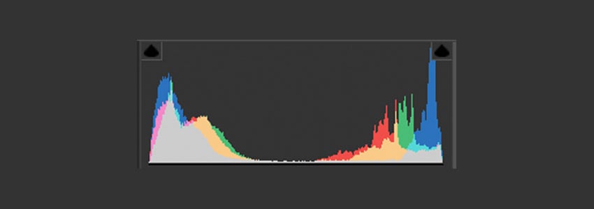

Your histogram represents how many pixels are at each luminance value in your photograph. Low values across the graph mean an image lacking in contrast, high values in the shadows and highlights mean greater contrast. Values that spike high on the far left or right indicate clipping of the shadows or highlights which means a loss of information; you won’t be able to recover these fully.
Choosing a Contrast Level
Whether you want to increase or decrease contrast will depend on your photo. This tutorial looks at increasing contrast in an image to demonstrate, but here are a few useful things to consider when thinking about contrast generally:
Higher Contrast
- Pros: Cinematic, dramatic, simplifies how we read an image
- Cons: Can be uncomfortable to view
Lower Contrast
- Pros: can be visually interesting, can create a vintage or retro look
- Cons: it can be harder to read an image as details can feel flatter and features don’t stand out as much
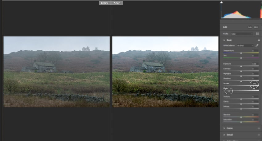
Method 1: Contrast Slider and White and Black Sliders
Contrast
The Contrast slider is your first option in adjusting contrast overall in an image, and many times it is enough, but it can be a bit blunt.

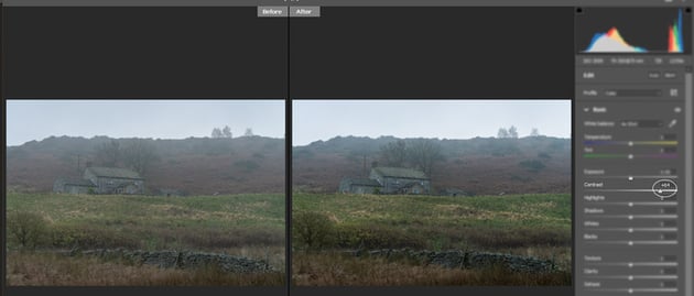
Above is the before and after result if you only use the Contrast slider. Drag right to increase contrast and left to decrease it. The result of adding it here isn’t bad but it’s applied globally over the whole image, and there are better ways to get more finely-tuned contrast.
Black and White Sliders
Similar to contrast but instead of one slider for global adjustments you can focus on increasing the whites and decreasing the blacks to add contrast (or vice versa to reduce it). Again, it's straightforward but lacking in finer control.

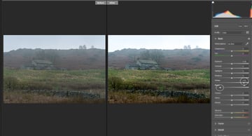
Method 2: Point Curve
The Point Curve gives you the ability to control contrast in different parts of the image in a precise and subtle way.


Like a histrogram, curves are an interface where the tones in your photo are represented on a graph. Here’s how Adobe describes a tone curve: ‘The horizontal axis represents the original tone values of the image (input values), with black on the left and progressively lighter values toward the right. The vertical axis represents the changed tone values (output values), with black on the bottom and progressing to white at the top.’
I'm skipping over Parametric Curve here because Point Curve gives you more control, but you can find out more about it in the article linked above.
You’ll notice in the screenshot above that next to Point Curve there’s a drop-down box where you can select some predetermined levels of contrast. It’s worth checking what each of those do to get a better understanding of how curves affect contrast.
The straight diagonal line is how your image is with no changes. The peaks on the graph represent areas of more contrast, so you can see from the screenshot that everything is pretty much grouped in the middle, which makes sense as it’s a flat image.
To add a custom control point click on the curve and to remove one, drag it off the graph of selected and hit delete.
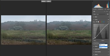
S Curve
You might have heard of an ‘S’ curve. This refers to creating points on the curves grid that looks like the shape of a slanted letter S. She more defined that is, the greater the contrast.


Essentially what this means is lifting the value of the lighter pixels (while preserving the brightest highlights from clipping) and lowering the value of the dark tones (while preserving the darkest shadows) and this has been done in the example above by making three custom points on the graph in addition to the two at either end of the diagonal line, and then pulling them up in the lighter sections of the graph and down in the darker ones.
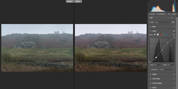
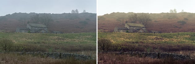
Method 3: Colour Wheels (Grading)
As contrast affects saturation, the reverse is also true. That means that you can manipulate the colour in your photograph in order to change the perception of the contrast. Higher contrast makes colours feel richer, but it can also create a wash of over-saturated colour, especially in the shadows.

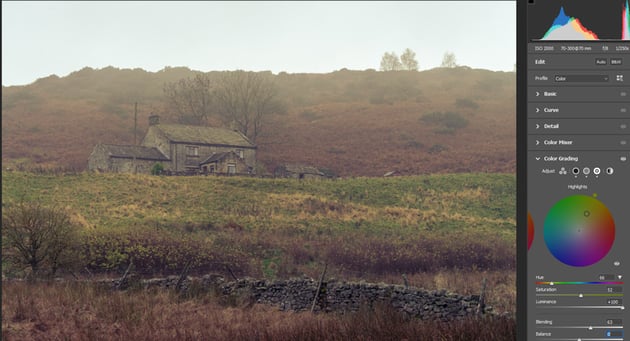
The new Colour Grading menu in Adobe Camera Raw gives you access to shadows, midtones and highlights, with the added benefit of a Luminance adjustment for each tonal group.
This new menu creates a fast and simple way to immediately increase the perception of contrast by working with colour. We can darken the colours in the shadows, and possibly remove some saturation from them, while lightening colours in the highlights.
Remember that using the Colour Grading wheels to adjust contrast means you’re effectively colour grading at the same time, so look for a balance between ideal contrast without crushing any details, and protect the colouring you want for the photo.

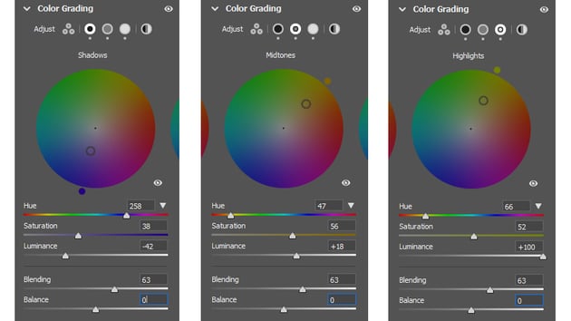
Above are the choices I made across each tonal range via the colour wheels for demonstration. It made sense to opt for a blue shift for the shadows and a yellow shift for the highlights, both because of the colouring of the image but also for the effect of blue making the shadows look darker and yellow warming up the highlights. The perception of contrast is greater with these colours in opposition, and the richness of the image is increased. Luminance adjustments do a lot of heavy lifting here.
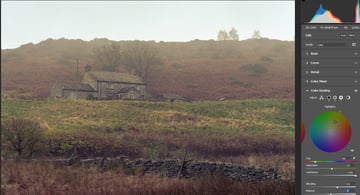
All Of The Above
Let's put it all together.

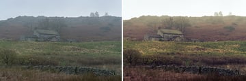
Each of these methods of adjusting contrast has merit and there's no right or wrong answer. Most likely—as mentioned at the start—you'll use a more subtle combination of all or some of them to create your ideal level of contrast. The image above makes use of all of the techniques in this article.
Keep Learning About Adobe Camera Raw
Here are more free tutorials about how to process your photos with Adobe Camera Raw:

 Adobe Camera RawHow to Merge and Edit High Dynamic Range Photos in Adobe Camera Raw
 PhotographyHow to Create a Panoramic Photo in Adobe Camera Raw (Great for Landscapes)
 PhotographyHow to Use Texture, Clarity, Dehaze, Vibrance and Saturation in Adobe Camera Raw
 PhotographyHow to Colour Grade Photos Using 3-Way Wheels in Adobe Camera Raw (Free)
About This Page
About the Authors
Marie Gardiner is a writer and photographer from the North East of England. After gaining her degree in Film and Media, Marie worked in the media industry, before leaving to set up the business she runs with her partner: Lonely Tower Film & Media. As well as writing about visual practices like photography and video, Marie is also the author of Sunderland Industrial Giant (The History Press, 2017) and Secret Sunderland (Amberley Publishing 2019). Her photographic work focuses on landscapes and industrial ruins, particularly those of the North Pennines as she continues to work on her long-form documentary project Changing Landscapes.
Jackson Couse edited this post.
Share Your Craft on the Envato Forums
Did you try one or more of these techniques? What did you think? Please let us know on the Envato forums, we love to see what you create with these tutorials.

No comments:
Post a Comment