In this article, we'll show you the anatomy of a magazine cover so you can learn to make the best magazine cover designs by yourself.
Designing a magazine cover can be tricky as there are many different approaches. An effective cover includes many different elements, and the challenge lies in making all of them work like a fine-tuned orchestra. In this article, we’ll show you how to make the best magazine cover design possible. We’ll go through the different elements that exist on this important page—so you’ll learn some magazine front cover terminology—and their impact on your design and the reader. We’ll also talk about some famous cover designs throughout history.
Looking for stylish magazine cover templates? Envato Elements and GraphicRiver have awesome, high-quality libraries with magazine cover design inspiration for you to browse.
If you want to jump right into some of the best magazine cover tutorials, be sure to check out our tutorials on how to make a magazine cover:
 Book CoverHow to Make Your Own Sports Magazine Cover (With a Magazine Cover Maker)
 Magazine DesignHow to Make a Time Magazine Cover Template
What Are the Elements of a Magazine Cover?
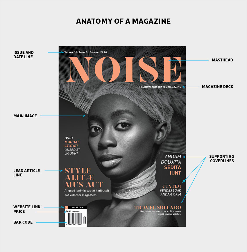
The cover of a magazine is the most important opportunity to sell your publication to readers. The best magazine cover layout design grabs attention, is visually striking, and stands out from the rest. A magazine cover is an opportunity to invite your readers to explore the publication, acting as a midpoint. A good combination of elements will make the perfect magazine cover. So, what are the most essential elements you should have on your magazine cover design? Let’s take a look and use the image below as a magazine terminology glossary:

As you can see, there are many elements that make up a magazine cover template. Let’s expand the elements shown above and learn about the impact they make:
Masthead
If you've ever wondered how to design your own magazine cover, it's best to start with the masthead. This element is one of the most important on the cover of a magazine. This is where branding also becomes important. The masthead is the title of the magazine and the most consistent element throughout the publication's issues, and it's how readers will recognize the magazine on stands.
The masthead is the largest font size that will exist in the magazine. While the size and placement are consistent, the colors of the masthead will change to match the theme or main image. Check out the cover of this InDesign magazine template.
HQ Letter Embraced InDesign Magazine Template (INDD)
This minimal magazine cover is clean and modern. The masthead is placed near the bottom of the page. The cyan details make it stand out against the subtle colored image and the white background. This magazine cover template also comes with 25 interior pages so you can complete your design.

Magazine Deck
Not all magazines have a deck, but it can be useful to describe the magazine’s philosophy or the type of publication. The magazine deck is usually only a few words long—it should be concise and to the point.
Date Line
This is the month, year, and issue number of the publication. Sometimes the price will also be included in this group. Depending on the publishing frequency, some magazines may use the month and year (January 2020), while quarterly magazines may include the season and the year (Summer 2020).
Magazine Issue
Magazine issue numbers are usually displayed as Volume X, Issue X. Volume refers to the years the magazine has been in circulation, while issue refers to how many times it has been published during that year. For instance, for a monthly magazine that was published in March 2020 and has been in circulation for 20 years, the listing would be “Volume 20, Issue 3”. If you're looking for magazine cover ideas to get some inspiration, be sure to check out these articles:
 Adobe InDesign28 Best Stylish InDesign Magazine Templates (New for 2020)
 Adobe InDesign25 Creative Free InDesign Templates
Main Image
The main image of a magazine can be a photograph or an illustration. That’s decided depending on the main story of the magazine and the art direction. Low-quality images can really ruin a magazine cover. Many magazines set up special photoshoots or commission illustrators to create a unique cover and use conceptual images. Crisp, clean, and detailed images will attract readers' attention and just scream quality.
Use visually strong images with a clear focus; cropping is totally acceptable here. Avoid using busy backgrounds, and choose a focal point on your image. Choose an image that will create an instant emotional connection with your audience.
Pro tip: If using a portrait, make sure the subject is making eye contact with the camera and therefore, the audience—it’ll draw the readers in. Experiment by making your own cover for a magazine and using your own image with the very best magazine cover tutorials:
 PlaceitHow to Put Your Face on a Glamorous Magazine Cover
 Magazine DesignHow to Create a Rolling Stone-Inspired Magazine Cover
Lead Article Line
Every magazine has a main theme for the issue, and that makes the lead article line on a cover. Try to emphasize the lead article line by using a slightly different font that goes with the theme. You can also use different colors that complement the imagery and adjust the size to have more prominence on the cover. This will create a dynamic cover and will be sure to draw your reader’s eyes to the lead article line element first.
Cover Lines
When it comes to the placement of the cover lines, aim for balance. Cover lines are set at a smaller point size compared to the lead article. Every magazine has one, depending on the topic or the person being interviewed. The cover line topics can revolve around the main theme of the magazine, but not necessarily. Cover lines should have no more than ten words and must be concise. Use words that will draw your readers in. Below, we're featuring a font from Envato Elements that's suitable for magazine cover designs:
Loverica Regular
This classic and modern sans serif is the perfect font for a magazine cover design. It's elegant and suitable for a fashion magazine. The set comes with seven styles and supports multiple languages.

Website Link
The rise of digital devices gave room for magazines to extend their contact on their websites. Remind your customers where they can find you online, be it your website or any other social media channels.
Price and Bar Code
Bar codes are taken care of by the printing house, but you do have to make sure to leave room for them. Their placement is at the bottom-left corner of the cover, and this space can also include the price of the magazine. Another option is to put the price next to the date and issue number of the magazine.
 DesigningCreate a Magazine Mockup Using InDesign and Photoshop
 Product Mockup22 Best Magazine Mockups Using an Online Generator (Cover, Layout, Flat, and More)
Iconic Magazine Covers
Print may be almost dead, but magazine covers are still very relevant. Cover designs are one of the most talked-about parts of a magazine as they can impact and influence society. Covers can be a catalyst to start conversations that can make significant social change. To give you some magazine cover ideas, here are a few of the covers we've seen throughout history that have made an impact:
The New Yorker, 9/11/2001 magazine cover from their September 24th, 2001 issue represented the attacks of September 11 a few weeks before. The illustration by Françoise Mouly and Art Spiegelman shows the black silhouette of the Twin Towers against a dark background. The attacks shut down the world, and the image of a dark NYC was a representation of the somber memory. This striking cover works because it's rare to see magazine covers entirely dark, and this was a powerful one that represented the emotion of the Western world.

Esquire's cover design from October 1966 featured only type with the sentence "Oh my God—we hit a little girl" followed by "The true story of M Company. From Fort Dix to Vietnam" over a black background. Needless to say, the cover had a dark connotation. The story was about soldiers from M Company, from their time training in the U.S. to their deployment in South Vietnam. This cover made a big impact on society that led people to think differently about the Vietnam War and ultimately contribute to its ending.

 Print DesignDesign a Fashion Magazine Cover in Adobe InDesign
 DesigningCreate a Magazine Cover, Inner Spread With Mock-Ups in Adobe InDesign
Ellen Degeneres graced the cover of Time Magazine on April 14, 1997, with the cover line "Yep, I'm Gay" which was risky at the time. With this cover, she became a pioneer in the fight for LGBTQ rights and now stands as one of the most well-known activists. Degeneres's Time magazine cover is simple and clean, and the colors mimic the American flag as this was one giant step for society as a whole.

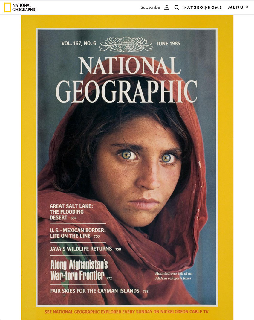
The most famous cover in the world comes from National Geographic's June 1985 issue. It features a striking photograph of Sharbat Gula, an Afghan refugee living in a camp at the border of Pakistan. Her gaze is haunting, and she had been hiking for weeks before arriving at the camp. Eye contact is important in any cover that features a person as the audience can make an easier and deeper connection with the subject.

 DesigningHow to Create a Professional Magazine Layout
 Magazine TemplatesHow to Create a Page Layout and Magazine Article Template in InDesign
Get Started on Your Magazine Cover Design
Now that you've learned the anatomy of a magazine cover, here are some striking assets that can help you get started with your design:
Magazine Cover Design (PSD)
If you don't know where to start when it comes to how to make a magazine cover, worry not! Templates are here to the rescue. This magazine cover design template in Adobe Photoshop is ready to print—simply add a picture and new cover lines, and you're good to go!

Creative Magazine Cover Template (PSD, INDD)
The cover of a magazine is the most essential way to sell it to readers. This minimal cover is sure to stand out from other covers that are visually noisy. Change the magazine cover with your own picture—you can do that in either Photoshop or InDesign. Easy peasy.

InDesign Magazine Template (INDD)
This professional magazine template includes 25 pages for you to showcase all of your amazing content. The layout is grid-based, so it'll always be visually perfect. This is one of the best magazine cover layout designs as it'll surely stand out from the crowd.

Apsari Beauty InDesign Magazine Cover Template (INDD)
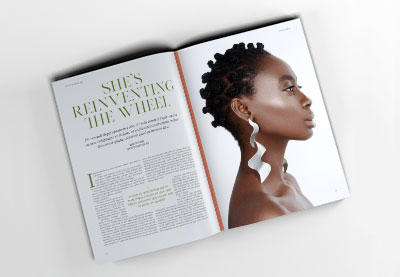
Less is more couldn't be more true—especially when you have beautiful, high-quality pictures to display on a cover. Take this image as magazine cover design inspiration. It's strikingly beautiful, and the color of the photograph and the layout can grab lots of eyes. Sometimes, something simple is just enough.

3 Magazine Cover Templates (INDD)
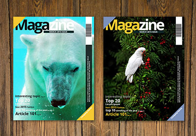
Are you an avid magazine designer? This magazine cover template set is perfect if you're in a rush. With three magazine cover options, you can rest easy, and all you have to do is input your own content. The files are set in InDesign and organized with Character Styles—you already know this will save you lots of time.

When you've got your magazine cover ready, place it on a mockup to see how it looks. We've got some awesome options that work for pitching your design to your clients:
Magazine Cover Mockup (PSD)
Pitching a magazine to your peers? Magazine cover mockups will help you take everything to the next level and make your design as realistic as possible. This file is based on a real photo—all you need to do is load up Adobe Photoshop and place your file, and voilá.

A4 Magazine Cover Mockup and Spread (PSD)
Present your magazine cover design in the most professional way with this magazine cover mockup. You can also add the rest of your magazine, perfect for a portfolio piece. The layers allow you to customize the shadows, other effects, and even the background to match your magazine design.

Conclusion
The anatomy of a magazine cover is essential, not only to drive sales up but also to be able to make an impact within our society. This article showed you how to design your own magazine cover by understanding every element you need. Nowadays, a successful magazine cover has to work on social media, bring awareness to important topics, and start conversations in our society. We've shown you plenty of magazine cover design inspiration to keep in mind for your next project.
We know that creating magazine covers can turn into a real challenge, especially if you don't have much experience. Magazine cover makers like Placeit can help you make your magazine cover by providing a number of magazine cover templates. So if you are facing time or budget limits, give this magazine cover maker a go!
Envato Elements and GraphicRiver have an ever-growing library of assets containing everything from InDesign magazine templates to the best magazine cover layout designs. Be sure to check it out!
We also have some great tutorials on creating your own magazine cover that can help you get started:
 Magazine Design10 Tips for Designing High-Impact Magazines
 Magazine DesignHow to Create Your Own Magazines: A Step-by-Step Guide
 Adobe InDesignHow to Create a Simple Magazine Template in Adobe InDesign
 Magazine Design28 Best Magazine Cover Templates (InDesign & Photoshop PSD)
 PhotographyHow to Make a Travel Magazine Cover (With Placeit and a Photograph)
 Graphic Design10 Ways to Get Experimental in Editorial Design
No comments:
Post a Comment