Here are 25 quick PowerPoint presentation tips to help you improve your presentations. You'll see features you might not know about. Plus, get PowerPoint tips on changing your slide design to make your content shine. We've even called on some presentation experts for their best tips.

How to Make a Good PowerPoint Presentation (Watch & Learn)
This screencast is a speed round of my very favorite PowerPoint tricks. It's a great resource to learn how to make a presentable PowerPoint. I'll walk you through ten of my favorite features or design steps to create a better presentation with PowerPoint presentation tips and tricks.
Keep reading for an illustrated version of these good PPT tips (and more) that you can use to improve your PowerPoint presentations. You'll see 25 of our favorite PowerPoint presentation tips and tricks, including techniques to update slide master PowerPoint 2021 designs.
25 Tips: How to Make Good PowerPoint Presentation Designs Fast in 2021
A few tried and true tips can help you speed up your PowerPoint presentation design. Check out 25 of my favorite PowerPoint tips to do just that. Each of these give you PowerPoint slideshow help to create good PowerPoint slides:
1. Use a Custom PPT Theme Design
Above all, I consistently use custom PowerPoint themes. Microsoft has built-in themes that you can use for free, sure. But the premium themes that are on Envato Elements are a major step-up from PowerPoint's built-in themes.

When you subscribe to Envato Elements, you'll have access to unlimited downloads of all the PowerPoint themes. Right now, Envato Elements has almost 4,000 PowerPoint themes and that number is always growing. You'll learn tips for a good PowerPoint presentation by using the best templates.

The reason that these themes are so useful is because they contain ideas. They're more than just a set of colors and font choices. Instead, they come loaded with ideas for slide designs. You can drop your own content in the placeholders to skip the hard work of recreating each presentation from scratch.
2. Make Use of Charts and Graphs
Illustrate your data with the use of charts and graphs. Not only will you be able to make your presentation more visually appealing, but you'll also help your audience remember the information better.
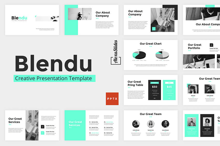
Many PowerPoint templates already include chart and graph elements. Easily customize them to make your data and stats more interesting and easier to understand.
Want to learn more about how to use data? Turn to Adrienne Johnston, a presentation professional:
When it comes to visualizing data in presentations, we have to remember that our audience does not need all the fine details of the data - they need the main takeaway and we need to make sure that's evident to them when looking at the slide.
3. Use the Built-in Slide Layouts
Inside of PowerPoint themes, you'll find layouts, which are custom slide designs. Most themes will include a selection of content layouts that you can use as a starting point for your own slide designs. You can leverage slide master PowerPoint 2021 designs with the help of layouts.

Layouts are like a starting point for your PowerPoint presentation slides. They contain combinations of placeholders for text boxes, images, and more. Instead of clicking and drawing individual objects onto the slide, use one of these layouts to start your slide off. It's one of the top PowerPoint presentation tips and tricks to save time.
4. Align Text Consistently
When you're working with text on your slide, it helps to ensure that it aligns consistently. Keeping your text aligned in the same orientation really makes a slide look clean.
In the example below, I've basically got three text boxes: a headline, a paragraph, and a list of bulleted points. Notice that all this text is aligned left.
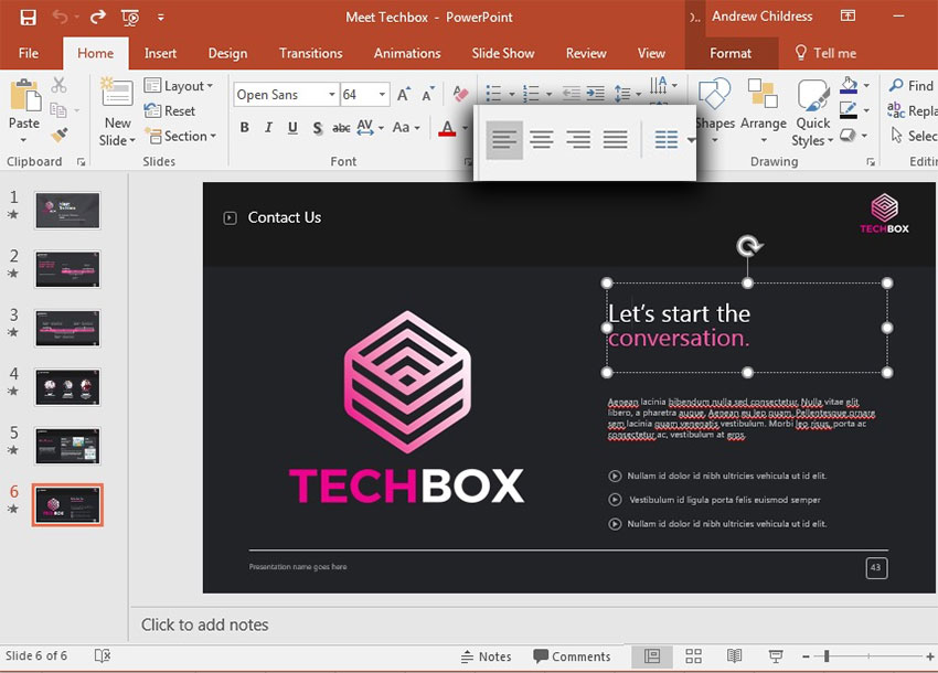
Aligning text was an "aha" moment that I learned when I started studying slide design. It's one of those steps that makes a slide look much neater and professional, so keep it in mind when designing.
5. Make Your Exports User-Friendly
No matter how great your PowerPoint presentation slides look, you need to think about how your user will use the presentation file.
Any of these are likely scenarios if you're regularly sending presentations to other users:
- The viewer may not have PowerPoint installed on their computer.
- The recipient may be using a version of PowerPoint that renders the presentation differently.
- Maybe you don't want the user to be able to make any edits or see your notes in the presentation file.

In this case, my favorite tip is to export the presentation as a PDF. To do that, go to File > Export > Create PDF, and then save your presentation as a PDF. This is sure to help most of your users see the presentation just the way you intended.
6. Try a Different Color Scheme
Many PowerPoint themes have more than one color scheme that you can apply to your presentation. On the Design tab, click on the drop-down next to Themes to try out a different color scheme.

Typically, these will restyle your entire presentation. Premium themes that you might get from Envato Elements, for example, may have many versions inside the original presentation zip file.
7. Edit Slide Masters for Consistency
The slide master controls the design for your PowerPoint slide. Instead of making the same change to each slide, apply a change to a slide master. It'll affect all the PowerPoint presentation slides that use the same master.

It's ideal to apply a logo to the slide master itself, for example. This will keep the logo the same size and in the same position on each slide.
To do that, go to View > Slide Master. On the right side, you're likely to see a variety of slide masters that control designs for many slides. Drop the elements that you want to remain consistent onto one of the slide masters.
8. Use the Alignment Feature
PowerPoint presentation slides look better when the objects on them are in line with one another. There's a certain visual rhythm that occurs when objects line up in the center or along certain boundary lines.

When you start dragging objects on your slide, you'll see guiding lines that pop up. These are very intuitive, and you'll likely notice that they help you line up your objects. You might seem them pop up when you've got a box that's equidistant between two other objects on the slide, for example.
This is one of the best tricks for improving the look of your PowerPoint slide. Spend some time making sure that your key elements line up cohesively.
9. How Do You Give a Memorable PPT Presentation?
If you're learning the top PowerPoint presentation tips and tricks, you're probably asking yourself: how do I give a presentation that won't be forgotten?
We all want to be remembered. The best PowerPoint slideshow help to make a mark on the audience. There are tried-and-true ways to do just that, and Neil Tomlinson shares expertise on being remembered:
Get your main point into the presentation as early as possible (this avoids any risk of audience fatigue or attention span waning), then substantiate your point with facts, figures etc and then reiterate your point at the end in a ‘Summary’.
10. Use Stock Assets
Earlier, I mentioned using Envato Elements to grab PowerPoint themes. But there's more that comes with an Envato Elements subscription for presentations.
That includes a wide variety of stock photos, graphics, and custom designed fonts that you can use in your presentation. Instead of reusing the same stock photo or clip art, Envato Elements has everything you need to supplement a presentation.

Again, Envato Elements is the perfect subscription if you build presentations. It's a one-stop shop that you can use to fill content.
11. Reduce Your Content
There's nothing that makes an audience tune out faster than being overloaded with slide content. Sometimes we try to make so many points that the audience misses all of them due to information overload.
Less is truly more. When you cut the weaker points of your presentation, the audience's attention will follow your key points accordingly.
It seems like cheating, but one of the best steps that you can take for your slide is to simply reduce the number of items that are on it. Convert some of your typed points to things you'll speak verbally. Remember: a PowerPoint slide deck is an aid, not the presentation itself.
12. Rethink Your Slide Order
Sometimes, I find that my presentations are out of order. I might spend too much time explaining my decision before I get to the conclusion.
In these cases, I like to use Slide Sorter View to re-sequence the slides in my presentation. To access this view, go to View > Slide Sorter on PowerPoint's ribbon.

From Slide Sorter view, you've got a top-down view of all the slides in your presentation deck. It sometimes becomes obvious that the slides can be reordered into a better sequence from this view.
13. Use PowerPoint Animations
One of my favorite PowerPoint presentation tips is to complement your major points with a bit of animation. Using animation can bring a key point onto your slide with style!
Check out ten of the best PowerPoint tips for how to use animation from Sven Lenaerts below:
14. Invite Collaborators
Building a presentation often benefits from a second set of eyes. That's why it helps so much to invite a collaborator to work with you side-by-side in Microsoft PowerPoint.
Pushing your presentation up to OneDrive and inviting collaborators is easy. Thanks to the cloud-based approach, more than one user can edit a slide deck in real time. Learn how to do that in the tutorial below:
15. Add Supporting Video Clips
Building impactful presentations is all about adding other perspectives and angles to the content. One of my favorite ways to do that is to add a video clip. Maybe that's a production that you built on your own or found on sites like YouTube.
Either way, learn how to add and auto play a video clip in the quick tip below:
16. Use Infographic Templates
More presentations than ever will feature visuals that tell stories with data. But it's easy for an audience become overwhelmed with data.
That's where infographics come into play. Learn to use them in PowerPoint in the tutorial below:
17. Use Impactful Closing Techniques
I've sat through many presentations in my life. I can only remember a few that really stick out, thanks to techniques that highlighted key points. You need PowerPoint tips and tricks that help leave your audience with an impact.
To do just that, make sure you use some of the techniques highlighted in the article below:
To do that, just drag and drop the thumbnails into the order you want. When you return to Normal view, the PowerPoint presentation slides will be in the resequenced order you set here.
18. Include Data in the Appendix
Many PowerPoint presentations include data in the form of charts and graphs. That means that you'll condense specifics into a few easy-to-follow charts.
But what if your audience wants more of the backing details? Maybe they want to validate and review the detail for themselves. In that case, a set of appendix slides with extra data is sure to help.

Appendix slides are included at the end of a presentation deck for backup purposes. You might not present them, but your audience is certain to appreciate that you included them. That helps your presentation continue to be useful even after you leave the room.
Here's a great tip from: pro presenter Graeme Thomas of Johnny F Designs:
If (my clients) are sending the deck straight to clients however, I would then put all the information on the slides but will often use more slides so that they aren't too cluttered. In cases where there is a lot of content, like financial statements, I would use appendix slides.
Including an appendix helps your audience understand data without overwhelming them with that data. Follow these tips so that you get the best of both worlds.
19. Alternate Between Solid Color and White Slides
Alternating between solid color and slides with a white background can produce an interesting visual effect and engage your audience. You can use the solid-colored slides to signify a new section in your presentation.

Not to mention, solid colored slides are the perfect way to re-enforce your brand colors and build your brand recognition.
20. Present Information With Maps
If you’re trying to make a case for a global expansion or need to report on how other branches are performing, consider using a map to help your audience visualize the data. There's no shortage of quality PowerPoint templates with maps built in so be sure to take advantage of them.
21. Keep the Design Best Practices in Mind
The design of your presentation matters just as much as the content of your presentation. That’s why you need to devote an equal amount of time to making sure the design of your presentation is on point as you do to the actual content. Familiarize yourself with best design practices and keep them in mind as you go about customizing your template.
22. Practice Makes Perfect
Lastly, don’t forget to practice your presentation. Go through your slide deck a few times to make sure you know it like the back of your hand when the big day arrives. Doing so will help you feel more confident. It'll reduce any anxiety and nervousness you might feel as the presentation day approaches.
What's the best way to rehears for a good PowerPoint? Here's one of the top PowerPoint presentation tips from expert presenter Sandra Zimmer:
Once slides are ready, practice one slide at a time aloud until you feel like you know it and like the flow of speech. Be willing to change anything that does not feel in flow. At the end of learning all your slides, practice the whole talk.
If you want even more great PowerPoint presentation tips and tricks, check out the following post:
23. Adapt Your Presentation To The Audience
Let's say that you're a seasoned presenter with a pretty standard set of presentation topics. Maybe you're an expert in your field, and you're asked to give a PPT presentation frequently on similar topics.
That's the value of being an expert. You might have a standard spiel that you give your audiences and your content won't totally change from one presentation to another. That's why it helps to make only slight tweaks to adapt your presentation to each audience.
Leading presentation expert Suzannah Baum offered up this advice:
Different audiences will have different needs and different challenges, which requires me to re-sequence the slides, or create new ones. I tend to do a lot of research on my audiences – via surveys, interviews, and conversations with the hiring manager – to help me better understand what information would be most relevant to them.
How do you adapt to your audience? Here are a few tips:
- Learn about them. If you're asked to speak, talk to the curator of the presentation to learn more about the audience and their background.
- Ask about them! With contact details, send out a survey or a response link to ask for feedback and preparation info. Ask leading questions like "what do you want to learn?"
- Consider the environment. If you're presenting via Zoom, your style will differ from presenting in person. The key is to acknowledge the difference and adapt to your environment.

Learn everything you can about your audience. Learning how to make a presentable PowerPoint is all about thinking of the recipient, not the presenter!
24. Set a Time Limit
How many slides is the right number for you? Well, it all depends on the time limit you set for your presentation.
Believe it or not, setting a time limit is helpful to create good PowerPoint slides. If you want to learn how to make a presentable PowerPoint, it's a must to lock in the time limit and ensure that your slides support that timeframe.
Pro presenter Stephanie Ottavan offers one of our top tips for a good PowerPoint presentation based on time limits:
A presenter is usually limited to a specific time frame and you want to adhere to that as closely as you can. If you have animations and transitions in your deck, these take added time so make sure to rehearse in “show mode” of PowerPoint or Keynote and time yourself.
Believe it or not, setting a time frame is one of the most important part of creating a PPT presentation. It helps you influence how many good PowerPoint slides you should design.
25. Test Your Content Everywhere
PowerPoint in 2021 could take place anywhere. Maybe you present, online, in-person, or beam it to mobile devices. It's important to remember that the content will appear differently on each device.
PowerPoint Online is a different medium than many other apps. Make sure that your presentation design appears the same by testing it with the help of this tutorial. It shows you how your PPT presentation appears even in a browser:
Discover Great Premium PowerPoint Templates With Google Slides (For 2021)
Creating a great presentation starts with a great template. And a great PowerPoint slide design will use the best presentation practices, for example:
- Use high-quality photos and graphics to help tell the story.
- Keep text to a minimum.
- Stick to one idea per slide.
Designing a great template doesn’t mean you've got to start from scratch, though. Take a look at some of the best PowerPoint templates we've got on Envato Elements.
1. Neo PowerPoint Template

The Neo PowerPoint template features a modern and bold design and includes five color variations to get you started. Along with this, you'll also get 10 master slides and 30 individual slides for all your presentation needs.
2. Vexana PowerPoint Template

The Vexana template is a great choice for brands that need a touch of elegance. This template works with PowerPoint and Google Slides and comes with a grand total of 150 slides. It also has five color variations and includes infographic elements and photo placeholders.
3. Sprint PowerPoint Template

The Sprint PowerPoint template features a professional and modern design. The template is easy to customize. You'll find 20 masters in the standard 4:3 size, allowing you to choose the best layout for your information.
4. Travelicious PowerPoint Template

For any presentation that deals with the topic of travel, check out the Travelicious template. This template is compatible with both PowerPoint and Google Slides. It includes three premade color variations as well as 30 unique slides.
As you can see from the examples above, there's no shortage of beautiful and professional PowerPoint slide designs on Envato Elements. What’s more, Envato Elements allows you to download as many PowerPoint templates as you want. Plus, get thousands of other design assets such as fonts, photos, and icons—all for one low monthly price.
Want to see even more great PowerPoint template examples? Be sure to check out our related roundup:
Need Help? Grab Our Making Great Presentations eBook (Free)
We've got the perfect complement to this tutorial. You can find more information in our eBook on making great presentations. Download this PDF eBook now for FREE with your subscription to the Tuts+ Business Newsletter.
It'll help you master the presentation process from initial creative ideas through to writing, design, and delivering with impact.

Learn More About How to Make Presentable PowerPoints
These quick PowerPoint Presentation tips are some of my favorite ways to rapidly improve a presentation. Keeping them in mind while you build a presentation can help you build a deck you'll be confident about presenting.
Check out these tutorials to keep learning more about PowerPoint. These tutorials will give you more ideas for fixing up your PowerPoint presentation slides efficiently:
 Microsoft PowerPointHow to Make Animated PowerPoint Presentations With Templates
 Microsoft PowerPointHow to Make Creative PowerPoint Presentations (With Unique Ideas)
 Microsoft PowerPointHow to Add Text to PowerPoint & Make Amazing Text Effects
What do you want to know about PowerPoint? You've seen how to make a presentable PowerPoint, but we want your feedback. Which PowerPoint tips helped you improve your presentation the most? Let me know in the comments below.
Use These PPT Presentation Tips on Your Next Presentation
Now that you've studied some of our best PowerPoint tips, it's time to put them to use. Download one of our top-notch PowerPoint themes from Envato Elements to get started. These PowerPoint presentation tips and tricks give you confidence to make you a skilled presenter.
Editorial Note: This post was first published in February of 2019. Our staff updates this post regularly— adding new, exciting PowerPoint tips and templates (with special help from Brenda Barron and Andrew Childress.


.jpg)


No comments:
Post a Comment